Why does Wikipedia in 2018 have a mobile site and a desktop site?
Wikipedia continues to have separate mobile and desktop sites. Why?
The importance of choice in Wikimedia’s many projects
Recently, a tweet popped up in my feed: “funny how mobile wikipedia is easier to read on desktop than desktop wikipedia.”
So why does Wikipedia continue to have a desktop version in 2018?
This is not a new question and by far the most common comment relating to Wikipedia I see on Twitter. Because I’ve been working on the mobile site for six years now, I feel like I am well-versed to answer. The short answer: Wikipedia’s editing and reading experience has always and probably will always be based on giving user’s choices.
Wikipedia users have lots of preferences
The need for choice in Wikipedia becomes apparent when you sign up to an account and look at the preferences pane. The Wikipedia preferences page for logged-in users contains a myriad of options for users to customize their experiences on-site.
The Watchlist page, used by editors to keep track of page changes they care about or have previously edited, allows users to limit results to a number of days and hide interface elements that are not useful. This, however, presents other challenges. When the user personalizes their experience, it becomes harder for us to cache content. It’s for this reason that logged in users of Wikipedia get a sub-optimal experience, from a performance perspective, compared to anonymous users (HTML is not cached).
As well as per-page preferences, there are many options to control the reading experience. Users can select a preferred gender and language, and turn on and off features — for example the page previews feature we released in April as well as our experimental beta features. A gadgets option, which predates Chrome and Firefox extensions, allows users to opt-in to community generated scripts and styles (these are wiki pages with JavaScript e.g. ImageAnnotator).

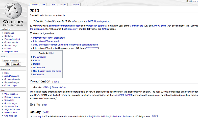
More surprisingly, there is an option in user preferences to set the skin to “Monobook”, which was used before Wikipedia last changed its interface in 2010.

Skins
Why is the old 2010 design still available, I hear you cry?
Quite simply, because many users back in 2010 preferred the older design. To move forward, the old one was kept around.
Wikipedia is unique compared to other websites because its community is not only invested in its future, but helped build it collaboratively from the ground up.
Rolling out new changes without thinking about how the user community may react can be problematic. When Instagram rolls out a new algorithm or Facebook changes its wall, there are always some disgruntled users who eventually adapt or move on. For example, I used to be an avid user of Foursquare, but in 2014 when they split their app into Swarm my usage dwindled to near zero. It was only in 2017, three years later, that they realized why they’d lost users like me — I was using it in a different way to how the engineers intended. I was using it as a life log, they were seeing it as a guide book.
Change disrupts your community whether you like it or not, but whether you ignore their reasons for the disruption is your choice.
The history of Wikipedia’s skins
In 2010, prior to the current desktop redesign, the search box was moved from the left hand side of the screen to the top right. Now, this seems like an obvious change, but back then this was met with much frustration by users with wide-screen monitors, as one user complained:
The new position on the top right is so far away (especially with new huge monitors), it always needs a turn of my head to find the search.
In 2013, there were even more skins than the current day, and it was a maintenance nightmare. Quite rightly, various outdated skins were removed from the Wikipedia experience, but many people had opinions around this. Attempts have been made to reduce this list of skins even further, or as recently as this year to clarify that they are unmaintained, but with no results.
In 2014, keen to iterate on the desktop appearance, a typography refresh for the desktop site was undertaken, with the modest goal of tweaking the fonts. Again, many opinions, which left all those involved in the project (myself included) quite shaken and is quite nicely summarized by the fact the redirect page “OMGFONTS” exists and points to our project.
Why are H1 and H2 serif, and H3, H4, H5 sans serif on laptop/desktop (looks ugly), and why is H1 — H5 always serif on android smartphones (looks much better)?
VisualEditor, MultimediaViewer and various other projects have been built alongside strong opinions. As I discussed in an earlier post, one of the reasons the page previews feature took longer than it might in another organization was the energy spent involving the community in the decision making.
As recent as this year, a community member felt inspired to make Monobook (that 2010 design of Wikipedia) into a responsive skin. During a hackathon, the code was merged and deployed. Some of the feedback was surprising, showing that even after all these years, many editors remain in an experience built for Wikipedia’s early days.
One editor, quite revealingly commented:
“This is horrible. And it’s impossible to get the good layout on an iPad. In Safari, “Request Desktop Site” takes me to the mobile site. I then either request it again or scroll down and select “Desktop”, and I’m back where I started.”
To me, it feels that many Wikipedia editors do not want — do not need — a different experience on mobile.
The important of choice
Choice is important, and it’s arrogant to feel that the experience you believe is best is best for everyone. Looking at how Wikipedia has evolved and how people react to change, it’s clear to me that choice plays an important part in keeping a healthy decentralized community.
To many people, however, Wikipedia’s desktop site looks like it is stuck in a time capsule. In fact, recently, my work colleague noticed an uncanny resemblance to the 1996 SpaceJam site. While I must confess that I once saw this as a handicap, I have over time learned to make peace and even appreciate it.
Responsive design is not for everyone
Without any work whatsoever, desktop designs like Wikipedia’s remain feature-rich and can be panned and zoomed effortlessly and quickly without any modification with modern touch-screen devices. While readability might suffer, features do not — provided users can withstand the discomfort.
Responsive design — by which I mean adding a viewport tag to an HTML page — can solve this, but the approach is not without tradeoffs. Usually, when implemented by engineers, it’s implemented the wrong way. For example, media queries can be attached to something that has been built for desktop and under the constraints imposed by the HTML model that come with a desktop-first design. When building in this environment, engineers are forced to seek JavaScript solutions, hide content and make forced choices. Usually, feature rich interfaces are reduced to simplistic designs.
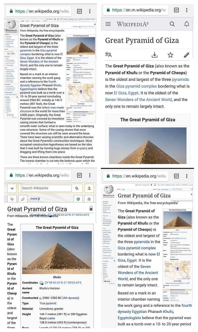
The mobile web version of Wikipedia, which was started by myself and others back in 2012, took a different approach. It was built solely to serve mobile users. As the site became more mature, we expanded to serve tablet users and more recently we have made minor changes to accommodate desktop users. Rather than take features away, we added them if and only if they were mobile friendly. Many features remain missing.
Having two sites, one responsive and one that is not, have helped us provide for our users’ diverse and unique needs, with important choice.
Mobile first
Building and focusing on the mobile experience faced many of the same pushback that our other projects have faced. We had the opportunity to throw some media queries on the desktop site and be done with the job, but we knew we had a long runway to work with (given the hope is that Wikipedia will be around in another 15+ years) and so decided to take the slower path. There was no mobile experience at this time, so there were no expectations and an important opportunity. Given mobile users were its primary audience and that there was a small empowered group of people who were building for the experience, it has been quite easy to push back on bad decisions with justification. Armed with web design and engineering best practices, we systematically and patiently rebuilt every part of the experience, with mobile users in mind and the knowledge that it’s easier to add and improve rather than change.
As the site became more mature, we focused on drive-by editors, thinking about the editing tasks that were easy to do on a mobile phone. Luckily, this focus has led to good results and nice feedback to combat the more negative opinions.
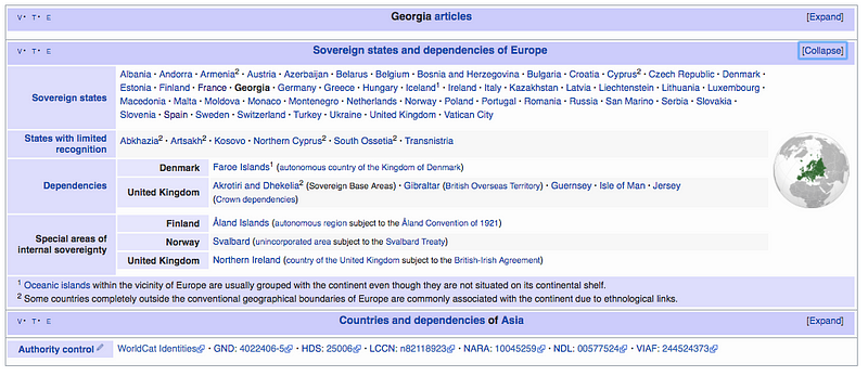
Many editors, quite rightly, have commented and still comment that the mobile experience is not as feature-rich. Many editors get frustrated that certain pieces of content do not render on mobile — for instance “navboxes,” those tables of links that appear at the bottom of some articles (see below). All these complaints are understandable, but have also been necessary to cater for the audience we serve. On hindsight, we should have called the mobile site skin “Patience”.
For many editors, who primarily edit on desktop, yes, the mobile experience remains inadequate. Luckily, these editors have the choice to use the desktop experience on their mobile phones and useful innovations, such as Chrome’s mobile-friendly mode provide an easy way for editors to switch to mobile-friendly reading experiences as necessary.
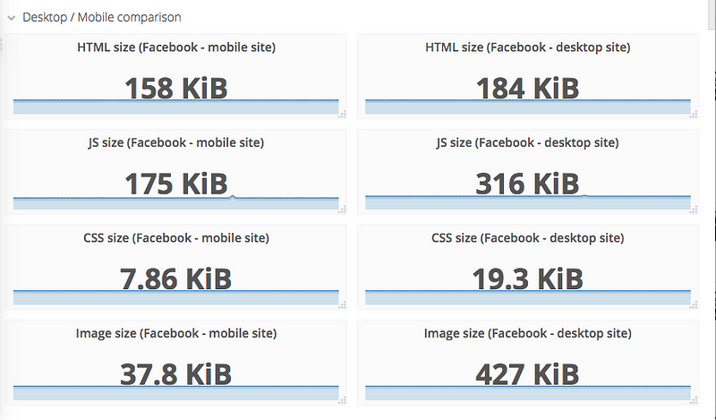
However, if you’re primarily a reader or a casual editor, you’ll find that the mobile site is better optimized for readability (margins and maximum widths on text). It will also save you hundreds of bytes over the desktop experience, as we defer the loading of images.¹ It’s also faster, primarily due to delivering one third of the CSS of desktop, which we can drop as legacy code that many of the desktop-specific community-written site scripts and gadgets require.
Wikipedia’s desktop site will improve over time, but the pace is slower as the needs of editors is greater and the baggage of fifteen years is worn on its back.
My team, who work on the mobile website of Wikipedia, would be foolish to think we can easily create a single experience that caters for the needs of casual readers and drive-by-editors as well as the more advanced editors with their needs for hundreds of preferences that has been built in fifteen years. Rebuilding is not a feasible option as with it would come much disruption.
Slowly and surely, we try to improve things for both editors and readers. The fact we still have a separate mobile and desktop site, provides us the environment we need to gradually make these changes and a channel to direct the impatient.
Wikipedia is playing the long game. It’s been around for fifteen years and hopefully will still be in another fifteen years, so as engineers, so do we. The content and the users are the two assets that are vital for us to sustain.
To many people the desktop experience of Wikipedia remains king even on a mobile device and it will remain so for some time, given the sheer complexity of the Wikipedia project and the many tools and experiences set up on that platform to support their activities. For others, with much more simplistic needs i.e. reading, mobile provides everything they need.
When visiting the mobile site on a mobile device and switching to desktop, it will set a cookie to keep you there on future visits. If you visit the mobile domain on your desktop browser, it will not. Even anonymous users have the choice of their preferred experience, and while a separate mobile site exists, they always will do.
Closing thoughts — an advanced mobile
This year, my team has bandwidth to start thinking about the many workflows our power editors need as part of its Advanced Mobile Contributions project. Current thinking is inline with the idea of choice — the feature will begin as a choice — an opt-in experience. Slowly but surely, the experience will get better on mobile (and hopefully desktop), for both readers and editors.
Maybe in many years time, the need for Wikipedia to have a separate mobile site may be a conundrum worth considering. If there’s one thing that feels sure to me, it’s that user choice in the experience will continue to be important.
Footnotes
This was originally posted on my personal account. It should be considered an opinion piece and does not necessarily reflect the views of my employers and colleagues.
I’ve referred to Wikipedia a lot in this article but what I really mean is MediaWiki the software that powers it. I use the more familiar term Wikipedia in the hope it doesn’t confuse. Apologies if it does!
This article was originally published on September 4, 2018. It was updated on October 11 to cut certain blocks of text which didn’t add much to the article, and added to Down the Rabbit Hole on November 7.
¹ A desktop proposal exists but was not received with much enthusiasm: https://phabricator.wikimedia.org/T148047