Wikipedia: The strange case of the wandering semicolon
And how this change and other small changes helped increased moderation on mobile
On a day in November, with the support of others¹, a somewhat absurd bug involving semicolons that took a week to fix was finally squashed. It was part of a group of changes that had led to a 47% bump in moderation tool usage on mobile. What follows is my account of this unremarkable incident as a reminder that a bug is never elementary; I will reflect on the the art of making progress in legacy code without disruption; and I will boldly hypothesize how the removal of a semicolon will improve the Wikipedia encyclopedia.
Disaster strikes
This was not the usual kind of semicolon drama that developers are familiar with. I didn’t crash a site with a PHP syntax error (at least not this time). I didn’t add a semicolon in a string boundary by accident. This was a semicolon in one of our many user interfaces for editors hidden away behind the scenes. It was a semicolon that was plaguing the mobile interface, making it a little more confusing.
Thursday was when the drama began to unfold. Like a virus, semicolons were showing up in all sorts of places. If you are an editor you may have noticed some semicolons in your editing interfaces that were not there a week ago. For instance, notice these two semicolons before the date:
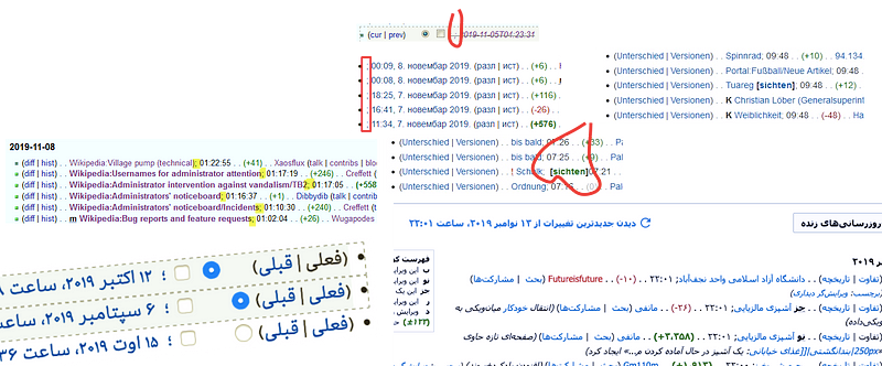
The bug reports were coming in — seven in total. All of them described the same underlying issue but in a different flavor. Semicolons had disappeared in some places — in some places pushing words together that shouldn’t be together! In some cases they’d appeared where they were not before. I was pointed to a long detailed conversation on English Wikipedia where editors reported semicolons were appearing in unexpected places. One reported:
“I’m a big fan of semicolons, used correctly; this one, I have to say, just looks weird.”
Another pondered:
“There could be a reason for this, perhaps?”
A third added:
“I don’t remember there being an announcement of this happening. Is this a glitch or an intended feature?”
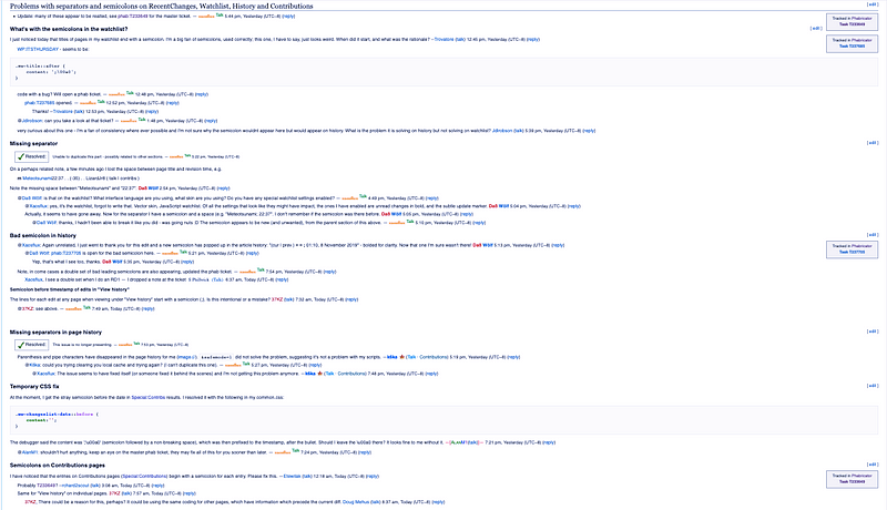
A semicolon is clearly not a feature. It’s not something you write blog posts about. “Wikipedia finally removes semicolon from mobile” is not exactly the kind of “feature” you might see at the top of Hacker News or Reddit. However, here I am writing about it.
So, how did we get here?
How we got here
The team has been slowly winding down the Advanced Mobile Contributions project. This project has added various moderation features to the Wikipedia mobile site². It also had strong, inflexible requirements from our department which were:
1 ) Don’t interfere with the desktop experience.
2) Don’t interfere with the standard mobile experience of ordinary users.
3) Make legacy interfaces available on mobile to users that opt in.
These requirements have been challenging to us; although mobile and desktop sites use different stylesheets, they share a lot of the same HTML. The HTML of these ten-year-old interfaces were built squarely with desktop in mind.
While some of this work has been adding links to the interface to missing moderation features, the real challenge has been making the legacy interfaces that those pages link to usable on a mobile device.
This work has involved taking complicated legacy interfaces that were built over ten years ago, and trying to mold them into things that are presentable on mobile, while at the same time making sure nobody using the desktop version noticed. While the engineer in me would ideally burn them all to the ground and rewrite them from scratch, we didn’t have enough people to commit to such a redesign. Instead, the goal was to get them into mobile in the quickest possible way “warts and all”.
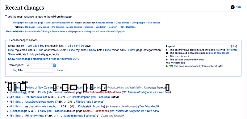
The RecentChanges moderation tool (which shows edits across the site, so our editors can watch out for vandalism) is a good example. Many assumptions on the desktop site had been made about how the page should look, and those assumptions didn’t help present the same page on mobile. The desktop site used semicolons, ellipses, and brackets to separate content. It did this in raw HTML. This screenshot hopefully illustrates the problem:
While we might imagine further improvements to such a page, remember we were not looking to make too many drastic changes as we didn’t want to touch the desktop site. My company is a non-profit. The goal was to remove a semicolon not to start a revolution.
On mobile we decided to stack this information vertically, like so:
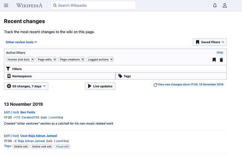
To do that, we had to get creative with CSS to ensure we kept things the same to desktop users while being able to change it based on the display media.
Luckily we found a solution using CSS media queries and CSS pseudo elements to do exactly that.
After such changes the RecentChanges moderation tool was looking good, but it had one nagging problem — a forgotten semicolon lingered in the UI after the page titles.
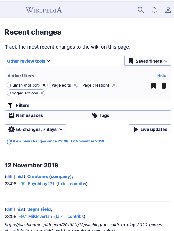
The follow up task “Stray semicolon in RecentChanges, Watchlist, History and Contributions interface” looked like just a one line change, continuing the work we had already done to remove unwanted “..” and unwanted parentheses.
Inspecting the HTML, I saw that the semicolon was in the raw HTML of the page. It served a purpose in the desktop version of the page by helping separate the content in each of the rows. However in the mobile mode it was redundant. I decided to move the semicolon from the HTML into a desktop only style sheet.
So I picked the bug up, I found where the semicolon was in the HTML and deleted it. Using the class name of the element that followed the semicolon, I added a CSS rule to the associated page. A fellow developer reviewed it, and like me, thought everything looked straightforward and the patch was merged. I focused on other things. As I did, the Earth orbited the sun. Light turned to darkness. Darkness to light.
The patch started to distribute out to our many websites. Then, the first bug report came in. The semicolon was not being translated into our many languages.
For those wondering how semicolons are translatable — this was news to me too — In French, a space must always proceed a semicolon, and here are some places where a semicolon is not the same semicolon we use in English:
In Urdu:
؛;In Persian:
؛
That was relatively straightforward to fix. We have devised ways to translate pseudo element content. The fix was quickly merged and deployed by a volunteer. I thought I was done; however more bug reports came in.
My semicolon logic was still not right. I had made some bad assumptions about where the semicolon was needed. I had assumed it would always show before a timestamp, but that was not true. The ten-year-old code was badly organized and badly documented. There were various edge cases in our complicated ecosystem. I sat down and wrote a spec and some very explicit quality assurance steps to make sure the undocumented behavior was documented.
My final patch, with the help of retroactively defining its behavior with bug reports from editors, was mostly an extensive documentation block to explain the behavior to the poor soul that would work on this code in future. The best thing a developer can do is write documentation for a future user, no matter how obvious it may seem. Developers that complain about documentation blocks need to be slapped with a wet fish.
On Tuesday, the patch had still not been merged due to the Veterans Day holiday. Nobody was around to review and deploy the patch.
Back on the discussion page, another anonymous user, possibly impatiently, asked “why is this still a problem?” The patch rolled out shortly after. Everyone involved was a little exhausted. An editor complained about semicolons that had always been there (I checked with git blame) and I wondered if anyone knew why we needed a semicolon at all? What would Kurt Vonnegut say? I decided those questions were best left for another day.
This exercise for me was a good reminder to never assume things and to treat every bug with caution, no matter how trivial it looks. There is no such thing as an easy bug. All bugs lead to other bugs.
Reflection
Much of the hard work to get our moderation tools available on a mobile phone was spent carefully dissecting legacy code like this. Even though we’ve tried to minimize the disruption to desktop users, there were a few exceptions. The semicolon incident was one of three incidents that got the attention of editors.
There was the Hideous history page incident” when some editors were angry that the touch areas for our form inputs, which had been made larger. While our intentions were to follow accessibility recommendations, some felt that the enlarged form got in the way of their workflow by pushing down other content. It should be “collapsed by default” said one.
There was the User Contributions incident, when, learning from the feedback of hideous history page incident, we collapsed a form by default, but the feedback was that we should not be collapsing the form that was a vital part of someone’s workflow. “Would prefer if it was expanded by default tbh” one user remarked. 🙄
There was also the Alarming “only a preview message” incident when we standardized the styles of a semantically identical component to avoid shipping unnecessary bytes to mobile mode.
The crux of this is that it was impossible to please everyone during this project. but we worked hard to keep a healthy balance. It’s amazing we pulled it off.
Sometimes the things that we work on that make a difference are not newsworthy, retweet-able, technically stimulating or even noticeable. Even with the semicolon incident resolved, there was no pat on the back or thank you. Silence was the best reward. The work we do might not use the latest technologies or be glamorous, but there is an art to making progress without disruption.
I will tell anyone that is available to listen, that being a skilled software engineering is not always about your code. It doesn’t matter what frameworks you use. Ultimately it’s an exercise in problem solving and supportive collaboration between co-conspirators. It’s about being responsible and being honest — a feature can take a lot of time if it’s being done well. It’s about understanding if a semicolon is important or useful. And it’s about being able to have that conversation.
One of our editors abian put it so succinctly when he shared these kind words:
It’s a great idea for users to generate content collaboratively and horizontally, but this model doesn’t favor process efficiency, user experience or innovation, so these areas require skilled professionals who fight against tradition, stagnation, short term and subjectivity.
How does this improve the encyclopedia?
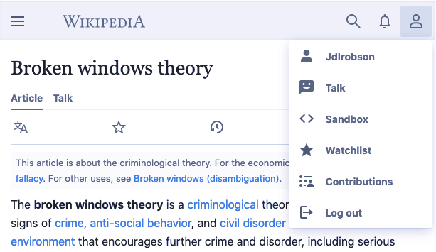
The Broken Windows Theory is a theory that says signs of crime encourage further crime. Similarly, in Wikipedia, bad experiences encourage further bad experiences.
I believe Wikipedia’s mobile experience has suffered because many editors have been unable to use tools inside mobile that they need to carry out their work and have been forced to live in the desktop experience of the site. As a result, they haven’t used mobile. As a result, they haven’t seen the broken windows that readers see. Barely anyone complained about the stray semicolon in the mobile site, but on the other hand, when a semicolon disappeared and appeared in places on the desktop site, seven bug reports get opened and everyone seemed to care about it.
The semicolon incident gives me hope, that if broken windows are being noticed in desktop, they will soon be noticed in mobile. It was pretty cool that our editors got this riled up about a semicolon. Imagine what happens when they get riled up about an experience that is unusable on a mobile phone. There’s no longer an excuse to be an editor using the desktop site on a mobile phone³.
I have nothing to concrete to point to you except several artifacts. A semicolon has gone; a form now has input fields that are actually big enough to be touchable on a mobile screen; certain forms are now collapsible and get out of your way when you no longer need them; there are links to certain features that previously were not there.
The amount of design and product wrangling⁴ that’s gone into this project is staggering. While to the outsider observer, we’ve simply added a bunch of links to the mobile experience, we’ve done it in a remarkably elegant way that doesn’t overload the user with information. Menu hierarchies have been revisited, and we’ve frequently had to make trade-offs between beautiful and functional.
My team, with the support of some wonderful volunteers providing feedback and triaging support⁵, has been making minor tweaks to HTML and CSS across the site, and these small things make a difference and should be celebrated. The advanced mobile contributions project has been about that. It’s been about small tweaks here there and everywhere.
The mountain of small thankless changes at times have felt repetitive and uninspiring, but we churned our way through them. On their own as bug fixes they are meaningless. The end results look unremarkable. However, when combined they build something incredible but less tangible — a better mobile experience.
Of course, our data, does give something more tangible. We're seeing an increase of 47% of moderation actions on mobile. So clearly, every semicolon removal makes a difference.
¹ Thanks in particular to Volker, Jan, Zoran, Xaosflux and Huji for your help in resolving the semicolon matter.
² Logged in users get more from Wikipedia. Logged in users can also opt into additional parts of the experience using our settings page
³ If there is a reason you feel you still cannot edit from a mobile device please let us know on the advanced mobile contributions talk page:
⁴ Hat tip to Alex and Volker for juggling all the different design pieces and Olga for making sure we didn’t get stuck in the weeds (sometimes you need someone to stop you going into Semicolon swamps).
5Thanks to Ammarpad, Masumrezarock100, stjn, Zoran and Pelagic and everyone else who has been involved for your input,codeand guidance to our team during these UX and standardisation efforts.

