Dark mode’s bright future: How we hope dark mode will transform Wikipedia accessibility
Dark mode is here for Wikipedia and as we speak is slowly rolling out to all our projects. While on the surface this may seem like a trivial project, in this post we’ll talk about the long journey to its release and the less obvious technical challenges it faced.

We’ve known for some time that Wikipedia readers and communities wanted a dark mode. The fact the feature has been absent has been a constant source of complaint on our social media accounts. It has been the most requested feature from our editors since at least 2019 and our analytics show that 20% of our readership has specified on the operating system level that they would prefer dark mode. While research is mixed, dark mode is often praised as reducing eye strain and helping people with medical conditions.
The problem has never been why, it’s always been how and as my team embarked on a project to improve accessibility for readers [1], we finally set out to answer that question.
The first challenge we had to overcome was making such a feature accessible to anonymous users, without compromising our site performance. Historically, because we cache page HTML using Varnish, we have to serve the same HTML page to all users. After consideration of various options, we addressed this during the Wikipedia appearance rollout by using a small inline script that read from a cookie and altered the classes on the HTML tag.
More difficult challenges remained…
Turning off the lights
Typically, dark mode experiences are achieved by switching CSS stylesheets to use CSS variables. The challenge for Wikipedia is that we have 20+ years of code, much of it without active maintainers, and some with large chunks of code written in libraries we deprecated over a decade ago such as jQueryUI. For over a decade, thanks to the long-term vision of several individuals, we have slowly been reviewing and standardising colours across our vast codebases. Much of this work has been thankless and difficult to quantify until recent years.
Then, in August 2021 the Wikimedia Foundation decided to adopt Vue.js as its future JavaScript framework. With this decision, the Codex design system followed for Wikimedia code, and we have been empowered to accelerate and benefit from these standardization efforts. The new Wikipedia appearance we rolled out in 2023 was a big catalyst and an essential stepping stone for providing a dark mode.
While this provided us with a path forward for making our user interfaces available in a dark theme, we had one remaining hurdle to overcome — user-generated content.
User-generated content
Wikipedia is one of the most unique websites. I think MySpace during its peak years is the only comparable site in the history of the Internet that has allowed the expression of user-generated content at the level that Wikipedia has. While most of Wikipedia is text, a lot of Wikipedia’s content is built with HTML markup, often via pages called templates which have very few limitations. The lack of limitations has allowed editors to build complex things like route diagrams and taxonomy tables which make use of colour for a variety of reasons, whether they be conveying information or expressing a brand. Much of this relies on the assumption that the text has always been black.
Wikipedia can be viewed outside our website, in apps such as the official Wikimedia mobile apps and WikiMed so it is important to consider where the content is viewed. The Wikimedia Foundation’s mission is: “to empower and engage people around the world to collect and develop educational content under a free license or in the public domain, and to disseminate it effectively and globally.”
Using colours in our content causes friction to this mission, as it means it is more challenging to embed our content in foreign places where the background is not white and the text is not black. This is therefore something that should be fixed.
Dark mode shortcuts
There is a well-known shortcut in developer communities for getting dark mode working on any site that various popular browser extensions have exploited. It works as follows: A small amount of CSS applies a filter across the page to flip colours to darker equivalents and an additional filter undoes that transformation for images to avoid them being color-shifted incorrectly.
We have been aware of this shortcut for some time, and it has been popular with many of our users with accounts for some time through Volker Eckl’s dark mode gadget. As with any shortcut, it pays to be suspicious. While this approach is popular with developers and can be shipped relatively quickly, it is not well understood and has problems:
- This technique can be computationally expensive. A substantial amount of people who tried out browser extensions utilizing this method report high CPU usage and in some cases slow scrolling or crashing browsers which correlated with older devices. While we failed to replicate this in synthetic testing, it was deeply concerning.
- Native emojis were unreadable in a way that was not correctable by editors.
- Content can be altered in a way that misinforms or confuses the reader.
Misinformation was a deal-breaker for us and should be for any website using user-generated content where colour can be used.
When colour is important
Sometimes colour plays an important part in an article. The shortcut approach had a worrisome trait best illustrated by two examples.
Consider this article on International Orange and notice, how the colour swatches are subtly different in both articles.
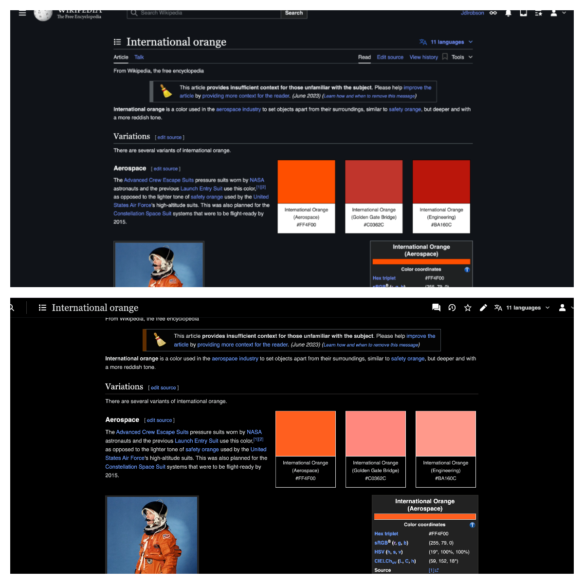
In the first example, the colours are correct. In the second image, the colours have been distorted by the “dark mode shortcut” and are now misinformation. However, to the average reader, nothing is wrong and there is a risk such an issue could remain undetected similar to many of Wikipedia’s hoax articles.
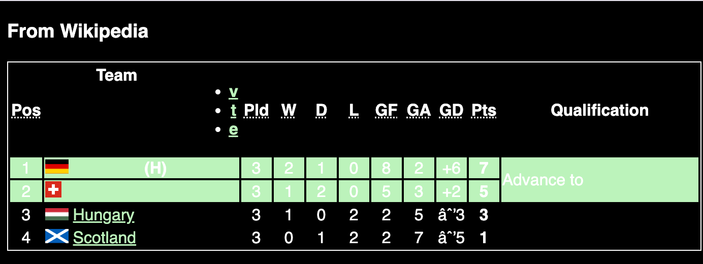
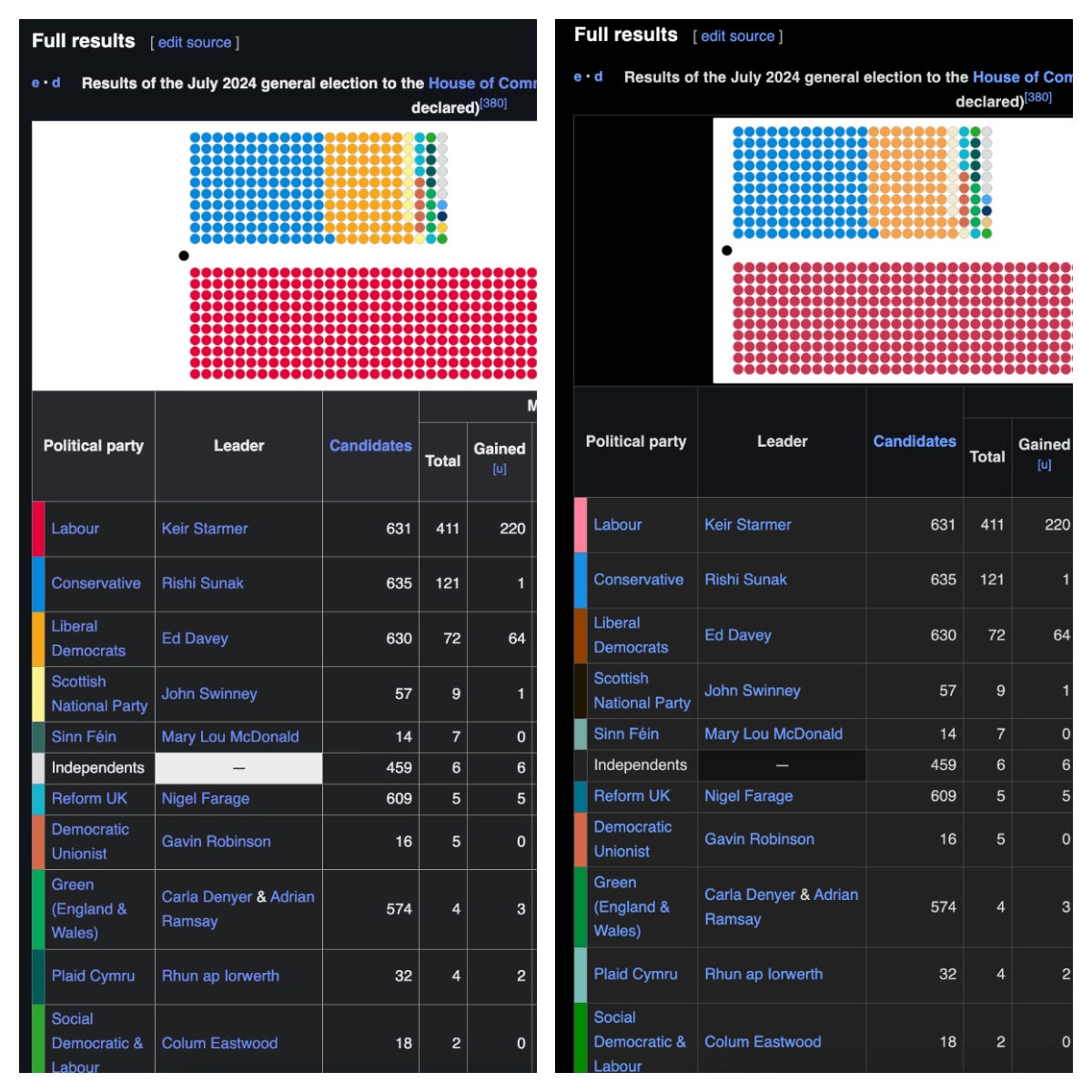
While in this particular situation, the stakes are low, it takes little imagination to see where this sort of colour misinformation can be problematic. For example, consider the implications of the recent United Kingdom election where colour distortion in a legend for a diagram could cause misunderstandings about which party is in the lead; or where someone is trying to determine what coloured gas is filling their room.

An accessible opportunity
As we began to build dark mode and evaluate potential fixes for the colour issues outlined above, we used the Web Content Accessibility Guidelines on colour contrast to determine which pages had colours and colour combinations that might make reading more difficult. Through this process, we discovered that regrettably Wikipedia already had many accessibility issues in its content in its previous light-only state, which were caused by editors selecting specific colours for templates or other parts of the content without checking contrast guidelines. The Wrexham A.F.C article for example has inaccessible red backgrounds on all its table headers, simply because the football team plays in red (this is now fixed!).
While colour can have semantic use in conveying knowledge — for example if describing the colour International orange, a colour helps. However most of the time it is a stylistic choice. Some colours also have undesired connotations that can lead to misunderstandings of information — for example, red can be associated with warning and danger. In general, colour in Wikipedia should be used wisely. As part of this project, we wanted to make it easier for communities to find and fix these issues with user-generated content.
Because Wikipedia can be edited by everyone, accessibility is all of our responsibility. Adding the dark mode feature provided an opportunity to improve our content. What better way to bring greater awareness to accessibility and existing issues, than using a widely desired feature as the vehicle?
While there are many editors well-versed in accessibility, there are many that are understandably not.

Improving our content
We decided that dark mode was an important driver for better accessibility, and that despite the challenges ahead relating to improving articles, it was important not to take a shortcut and instead make our content better. After all, Wikipedia is all about improving the encyclopedia and if there is one thing our community excels at it is fixing things that do not speak the truth. While this felt uncomfortable it felt like the right strategic choice.
By not taking the shortcut of distorting colours, we needed to update many articles working under the assumption that the text was black. For example, it was quite common for tables to have green and red rows, which would now have white text.
To support this, we created various tools for flagging issues to empower editors to make our content more accessible:
- We created a tool to generate reports of color contrast issues which we update regularly on a separate web page.
- We created a tool that flags pages where colour usage is ambiguous. At the time of writing, there are over 40 million pages where this is the case.
- We created a recommendations page to guide editors on best practices in this new world where dark mode exists.
- The desktop version will allow readers to flag issues with articles directly to editors.
Since our tooling and testing flagged many issues, to reduce the strain this would create for our editing community, we applied several generic rules to autocorrect many of the problems with content that we found (for example making text black whenever we could detect a background).
Given the challenges with dark mode because of these issues, and the time it would take to revisit these colour choices through an accessibility lens, we were more conservative with the initial dark mode release and have qualified it as an opt-in feature with a “beta” status and only released it to our websites where editors were actively engaged with fixing these issue. We’ll continue to monitor this for some time and plan to expand availability to other languages when we feel more confident that the work has been done to make our content more accessible than the current reading experience. If you edit Wikipedia and can help, we encourage you to do so.
As a reader, we hope you enjoy reading Wikipedia in dark mode. We’re sorry this took so long. Hopefully, it was worth the wait!
With thanks
This has been a journey with many challenging conversations! Special thanks go to Bernard, Edward, George, Jan, Jennifer, Justin, Kim, Mo, Olga, Nat, Szymon, and Steph in the Web team and to Anne, Barbara, Chris, Eric, Derek, Lauralyn, Roan and Volker in the Design Systems team who have incredibly patient and responsive throughout this project with our rapidly-changing needs. Thanks also to Volker and Leon whose early work many years ago provided the impetus for much of this work. Our community ambassadors Isabel, Martin, Mehman, Mohammed, and Phuong have played an essential role by keeping us connected to our editing community.
In addition, thank you as always to our community that helped us along the way and the key contributions from other colleagues and friends that helped us scale across our codebases and content. The Wikimedia Hackathon 2024 in Estonia played an important role! Rather than miss out on someone, I’ve created this page to celebrate all those many people — please help us expand it!
Thanks to Olga for helping me with this blog post!
¹ This project also included recently introduced controls for other aspects of the appearance like font size and colour — if you’re interested, you can read more about these changes in this Diff post by our designer Justin Scherer.
This blog post is available on my website and Medium.com.